Review: Polymer Clay Color Inspirations by Lindly Haunani and Maggie Maggio
I'm gonna let you in on a little secret. As the treasurer for my local polymer clay guild, I am responsible for ordering the books we select for our library. I am not, however, the librarian... so theoretically I'm supposed to order the books and have them shipped to the librarian. And that's usually what happens.
But occasionally, I'll have the books take a little detour. If it's a book I'm eager to get my hands on, I'll have it shipped to my house for a quick review, then I'll deliver it to the librarian.
That's what I intended to do with Polymer Clay Color Inspirations by Lindly Haunani and Maggie Maggio. Little did I know...
When the book arrived, I eagerly jumped in, starting with the foreword by Cynthia Tinapple. "You may think you'll never 'get' color the way Lindly and Maggie do," it starts, "but don't let the weight and complexity of this book fool you."
It was at that moment that I first took a look at the weight and complexity of the book. I began to realize what I was in for. This was not a book I could read through in a couple of days, cherry-pick a few exercises to do, and write a quick review. This was a textbook that would require in-depth study and intensive lab work. And it was a book I'd probably want to keep for reference. The next day I ordered my own copy and started my first long read through the book.
The Book
The book is 144 pages long — and while that may not sound considerably longer than your average project book, I'll warn you that many of these pages are pretty text-dense. Even the font seemed extra-small, like they needed to squeeze in extra content.
It starts with a color and clay basics section. The level of information they included in their "basics" section immediately gave me confidence in the expertise of these authors. For example, they compare clay to cheese or wine — products that continue to age after they leave the factory, and point out that there's therefore an optimal time to use the clay. This is something the Polyform chemist alluded to at this summer's IPCA retreat, but that I'd never seen written before. The intro also included an original method for referencing pasta machine settings, a cool pie-chart labeling system, and several Skinner blend variations.
But the "How Confident Are You in Working with Color?" quiz midway through the basics chapter almost changed my early opinion about the book. The reader is asked to rate various questions on a scale of 0 to 5. The questions included these that I found a little bothersome:
- I have taken a college-level course on designing with color.
- I have read more than one book on color designed for artists.
- I am never disappointed with my color choices.
To be fair, the 10 questions also included seveal with a more intuitive bias. But still, why would a confidence quiz need to ask a question about formal arts education or how many books you've read? Confidence (and intuitive color skills) can come without any training at all, judging from untrained artists I know who confidently do amazing things with color. And is it really fair to ask a "never" question on a scale of 0 to 5? Is there anyone who's never disappointed with their color choices? Since the instructions told me to take the quiz once before and once after I did the exercises, I'm guessing the point is make me aware of my own shortcomings, so I can tell when I've improved on them. But instead, I ended up feeling a little insulted by the questions, like the authors were trying to justify the book's existence using some unrealistic standards.
And that unsure feeling stuck with me through the first chapter and half of the next. The first 30 pages read like a textbook. There were several times I struggled to keep my eyes open (granted, I do have a teething 7-month-old, so that might not be
But just as I started to second-guess my decision to buy the book, things got better. Starting on page 31 (and continuing through the rest of the book), there starts to be a nice rhythm. They start breaking up the text with exercises and projects, giving you a few pages of reading and then lessons to apply your new knowledge. Once I got into this part of the book, I found it much more interesting.
The Projects
I've used the word textbook to describe it, but perhaps it's more like a workbook. There are lots of hands-on exercises in the book to ensure you're applying the lessons. The book includes:- 11 exercises: hands-on lessons in color
- 2 studio tools: exercises that create reference materials for your studio
- 10 projects: projects that allow you to apply knowledge while creating jewelry or other polymer clay pieces
The exercises and projects are not illustrated with big step-by-step photos, like you might find in a beginner's project book. It's more like three steps per photo in a lot of cases. And while the instructions were overall well-written, there were a few spots where I was confused and wished there were more photos.
Which brings me to one of my favorite things about the book... the website. Maggie Maggio has started a weekly "Saturday School" program on her blog, where she's guiding readers through one exercise or project per week. I think it's fantastic that the authors are around to answer questions readers run into as they do the exercises — makes it simple to get clarification for any confusing parts of the book. It's also a great way to make this could-be-overwhelming book more manageable. The Saturday School concept allows the reader to take the book in bite-sized pieces, reading the background and doing one exercise per week. That pace means it'll take about 6 months to get through all of the book's exercises and projects, which seems like a long time for those of use impatient to learn and start applying the book's lessons. But just about anybody can commit to squeezing one exercise per week into their busy schedules. I think the Saturday School is a brilliant idea, and I love that they're doing it.
But back to the book. Each chapter's exercises and projects build on the previous chapter's, growing more and more complex as the book progresses. I like that they show both of the author's samples of each project, allowing you to see how an individual's color palette preference can change the feel of a piece.
Each chapter also has an artist spotlight. Some of these artists I couldn't relate to at all, while others really spoke to me. Same goes for the artist gallery pieces sprinkled throughout the book. For example, I loved this quote that accompanied Melanie West's pod beads:
"I approach color the way I approach most of my life. I start with intuition and inspiration, and fine-tune with training and experience."
I have mixed feelings about the exercises themselves. On the one hand, I love organizing things, experimenting with all the possibilities, and cataloging the results. In a lot of ways, these exercises with their color formulas and pie charts are right up my alley. But I'm trying to keep my studio cleared of unnecessary stuff, and this book seems to create a lot of stuff: multiple color collages, pivot tiles, tasting tiles, etc. And I won't even start on how much time will be involved in creating these things.
But I feel I'm only going to get the real value of the book by doing those exercises.That's really the key to this book. Browsing through it and trying a couple of projects won't give you the full benefit. You have to spend time with it. The book expects deep, textbook-like reading and lots of hands-on exercise time. It's a class — a really good value for a class — but a class nonetheless.
And so, this book really isn't for everyone. You have to
My Results
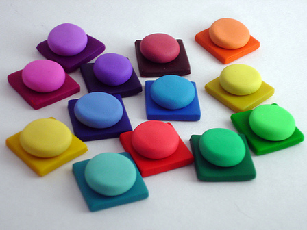
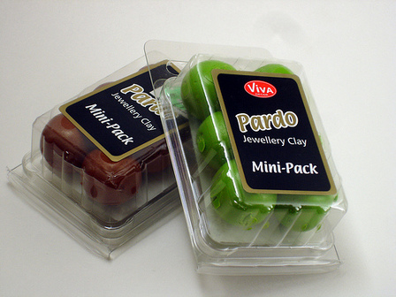
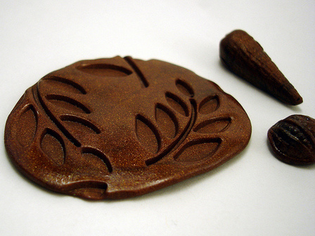
I've only tried the first couple of exercises (I'm going at their website's "Saturday School" pace). Here's a picture of my results from the first exercise, the package color testing:I'm very eager to try the color collage exercise, as that's really the basis for pinpointing and understanding my own color preferences. Later in the book, the pattern samples (which they refer to as "brainstorming with clay") sound like a lot of fun. And various of the jewelry projects — like the Ruffle Spiral Flower Brooch and the Pinched-Petal Necklace — caught my eye in a "I-can't-believe-I'll-be-making-something-that-nice" kind of way.
Having just done the first two, I honestly can't say that I've learned a lot through the exercises. I did, however, find lots of value in my first read-through — with "aha!" moments about using fluorescent colors, about the definition and purpose of mud colors, about achieving color balance, and more.
Summary
- Title: Polymer Clay Color Inspirations: Techniques and Jewelry Projects for Creating Successful Palettes
by Lindly Haunani and Maggie Maggio
- Price: $15 plus shipping
- Pros:
- Extremely thorough book that discusses color theory and provides hands-on exercises to help discover your personal palette
- Great value, since it's comparable to taking an in-depth color course
- Has appendix with worksheets and charts, which they generously encourage you to photocopy and laminate for reference
- Cons:
- There's a lot of content here, making it potentially overwhelming. I recommend checking out their website, where they guide you through the book's exercises at a manageable pace.
- Who It's Good For:
- Anyone, even non-polyclay artists, serious about improving their artwork through better use of color.

